13_ggplotLines
Line charts
Although the code for creating a line chart is different than for bar charts, it’s not that different. GGplot strives to make their commands fairly predictable and familar.
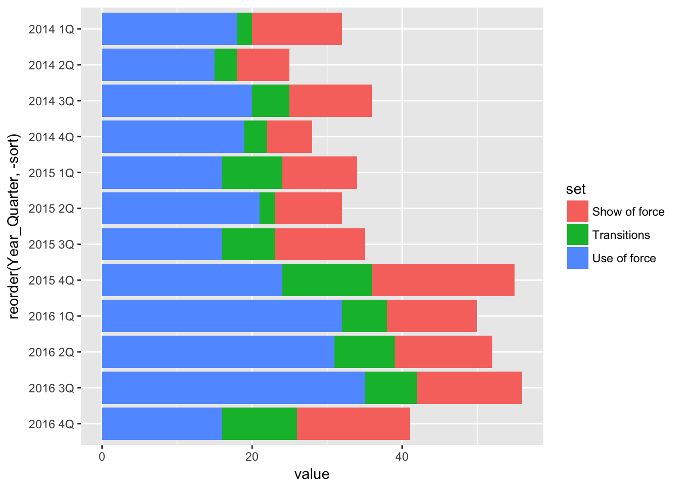
Let’s start by generating our basic stacked bar chart again.
# load the libraries
library(readr)
library(ggplot2)
library(ggthemes)

# bring in the data we worked worked with
df <- read_csv("dfsubset.csv")
## Parsed with column specification:
## cols(
## Year_Quarter = col_character(),
## year = col_integer(),
## quarter = col_character(),
## Total_CFS = col_integer(),
## Total_arrests = col_integer(),
## Total_RTR = col_integer(),
## sort = col_integer(),
## set = col_character(),
## value = col_integer()
## )# stacked bars
stacked <- ggplot(df) +
aes(x = reorder(Year_Quarter, -sort),
y = value,
fill = set) +
geom_bar(stat = "identity") +
coord_flip()
stacked
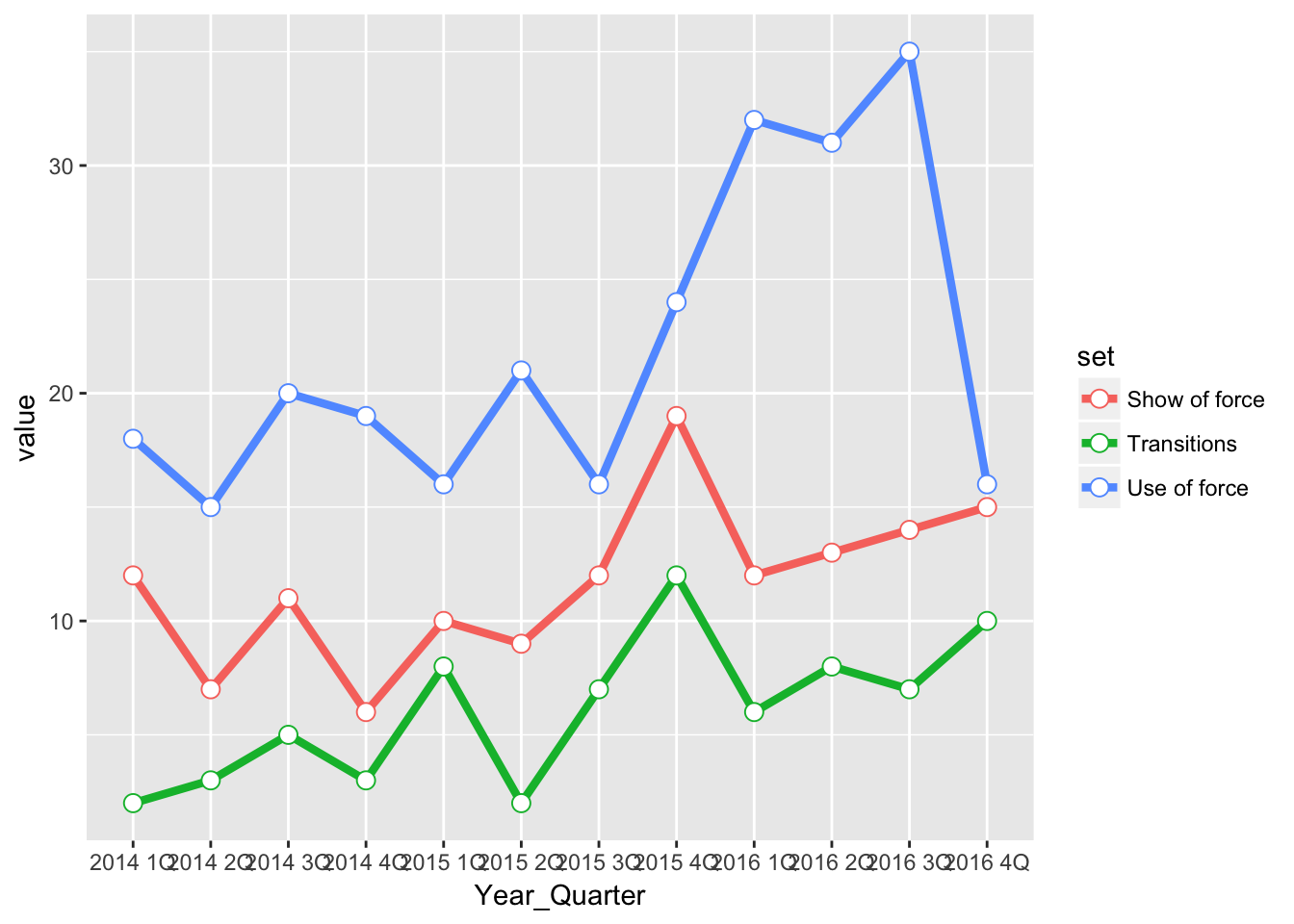
Now, let’s present the same data as a line chart and then compare the code.
pLine <- ggplot(df) +
  aes(x = Year_Quarter,
      y = value,
      group = set,
      color = set) +
  geom_line(stat="identity",
            size = 1.5) +
  geom_point(stat="identity",
             size = 3,
             shape=21,
             fill="white")

pLine
First, we don’t have to flip the x and y axis for the line chart, or sort the data. GGplot automatically plots it from left to right for us.
Next, instead of assigning the column “set” to fill, we assign “set” to both group and color. group does just that - it groups the similar data in the “value” column by the categories found in “set” so that ggplot knows what set of numbers in the column “value” should be used to draw each line. color should be understood the same way.
Instead of geom_bar we’re using two new commands that logically are called geom_line and geom_point. You don’t need to use geom_point if you just want to have the lines.
Each geom command needs the stat=“identity” line so that ggplot knows to plot the values in the column “value” and not the count of the values in the column “value” (which it does for a histogram).
For geom_line we set the line width at 1.5 points. For geom_point we sent the size of the point, tell it the shape to use (in this case a circle with a fill and a line) and then tell it the color to fill the circle. Not specifying a color will make the point empty.
Here’s a guide to the different shapes and line types that can be specified: http://www.cookbook-r.com/Graphs/Shapes_and_line_types/
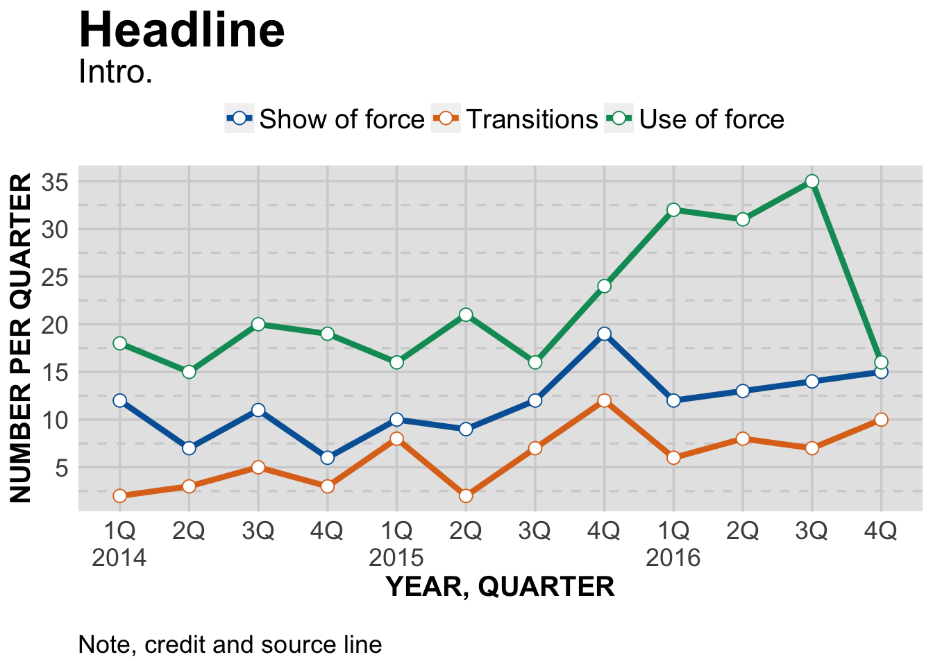
And that’s it. The rest is design, although the design challenges are a bit different than for bar charts. Let’s create a finished plot and go over them.
theme_gfx <- function(...) {
  theme_set(theme_get() + theme(text = element_text(family = 'Verdana', size= 12, lineheight=0.9))) +
    theme(
      # edit background colors
      plot.background = element_blank(),
      legend.background = element_blank(),
      panel.background=element_rect(fill="#E5E5E5"),
      strip.background=element_rect(fill="#E5E5E5"),
      # modify grid and tick lines
      panel.grid.major = element_line(size = .6, color="#D2D2D2"),
      panel.grid.minor = element_line(size = .6, color="#D2D2D2", linetype = "dashed"),
      axis.ticks = element_blank(),
      # edit font sizes
      plot.title = element_text(size = 27,face="bold"),
      plot.subtitle = element_text(size = 18),
      #legend.title=element_text(size = 13,face="bold"),
      legend.text=element_text(size=14.7),
      axis.title=element_text(size=15, face="bold"),
      axis.text=element_text(size=13.5),
      plot.caption=element_text(size=13.5, hjust=0),
      strip.text = element_text(face="bold", size=13.5, hjust=0),
      # This puts the legend across the top
      legend.position="top",
      legend.direction="horizontal",
      # removes label for legend
      legend.title = element_blank(),
      ...
    )
}

#-----Insert plot here -------------

pLine <- ggplot(df) +
  aes(x = Year_Quarter,
      y = value,
      group = set,
      color = set) +
  geom_line(stat="identity",
            size = 1.5) +
  geom_point(stat="identity",
             size = 3,
             shape=21,
             fill="white") +
  theme_gfx()

# Let's customize the x scale
# Remember \n = a line break
pLine <- pLine + scale_x_discrete(
  labels=c("1Q\n2014","2Q","3Q","4Q","1Q\n2015","2Q","3Q","4Q","1Q\n2016","2Q","3Q","4Q")
)

# Let's also customize the y scale
# we set the min and max, then where breaks should be
pLine <- pLine +
  scale_y_continuous(breaks=c(seq(0,40,5)) )

# add all the titles.
pLine <- pLine + labs(
  title="Headline",
  subtitle="Intro.",
  x="YEAR, QUARTER",
  y="NUMBER PER QUARTER",
  caption="\nNote, credit and source line")

# color scheme - comment out for B/W PDF
pLine <- pLine + scale_colour_manual( values = c("#0063A5", "#DE731D", "#009964", "#DA2128", "#6F2C91") ) + scale_fill_manual( values = c("#0063A5", "#DE731D", "#009964", "#DA2128", "#6F2C91") )
# make B/W PDF - remember to change name of file!
#pLine <- pLine + scale_colour_grey(start = 0, end = 0.75) + scale_fill_grey(start = 0, end = 0.75)

pLine
Just like with the bar charts, we use scale_x_discrete to create custom labels for the x axis. Remember, for bars we flip the x and y axis so that x is on the side. Here we don’t do that, so x is at the bottom.
Then, just to see how it works, we use scale_y_continuous to customize our y axis a bit. Previously, there were breaks every 10 points. Since we won’t have the values of the points show up on our chart, let’s make the scale a bit more informative.
scale_y_continuous(breaks=c(seq(0,40,5)) ) sets new breaks at every fifth point, from 0 to 40.
The difference between discrete and continuous scales is important. We know our x axis is a time sequence, going from the first quarter of 2014 to the fourth quarter of 2016. But ggplot isn’t able to understand it that way - it’s a mixture of text and numbers. It could just as easily be the names of towns or counties. So each value in our x axis is discrete.
On the other hand, our y axis is a range of numbers which we set to be from 0 to 40. So ggplot understands it as a continuous scale.
There are a number of scale_ commands, including ones specific for dates and times. Remember you can type “?scale_x_” in the console window and get a list of scales. Choose one to see the options for it.
Or, google “ggplot” and any command you might want to know more about.
Finally, we set the titles and other labels and we’re all set. When publishing, we can adjust the total depth of the chart so it’s not so squished, as it is here.
If you’ve done the previous tutorials, by now you should start getting familiar with how we’re organizing the ggplot commands.
The first portion, starting with ggplot(df) sets up everything we need to create a basic plot. Then we start customizing our x and y axis. Then set all the text that surrounds the plot. And finally we impose a color scheme.
That predictable code structure makes it easier to learn ggplot.
Next, area charts.