11_ggplotStackedBars
Stacked bar charts
Let’s use the data that we worked using the Tidyr library to create a stacked bar chart.
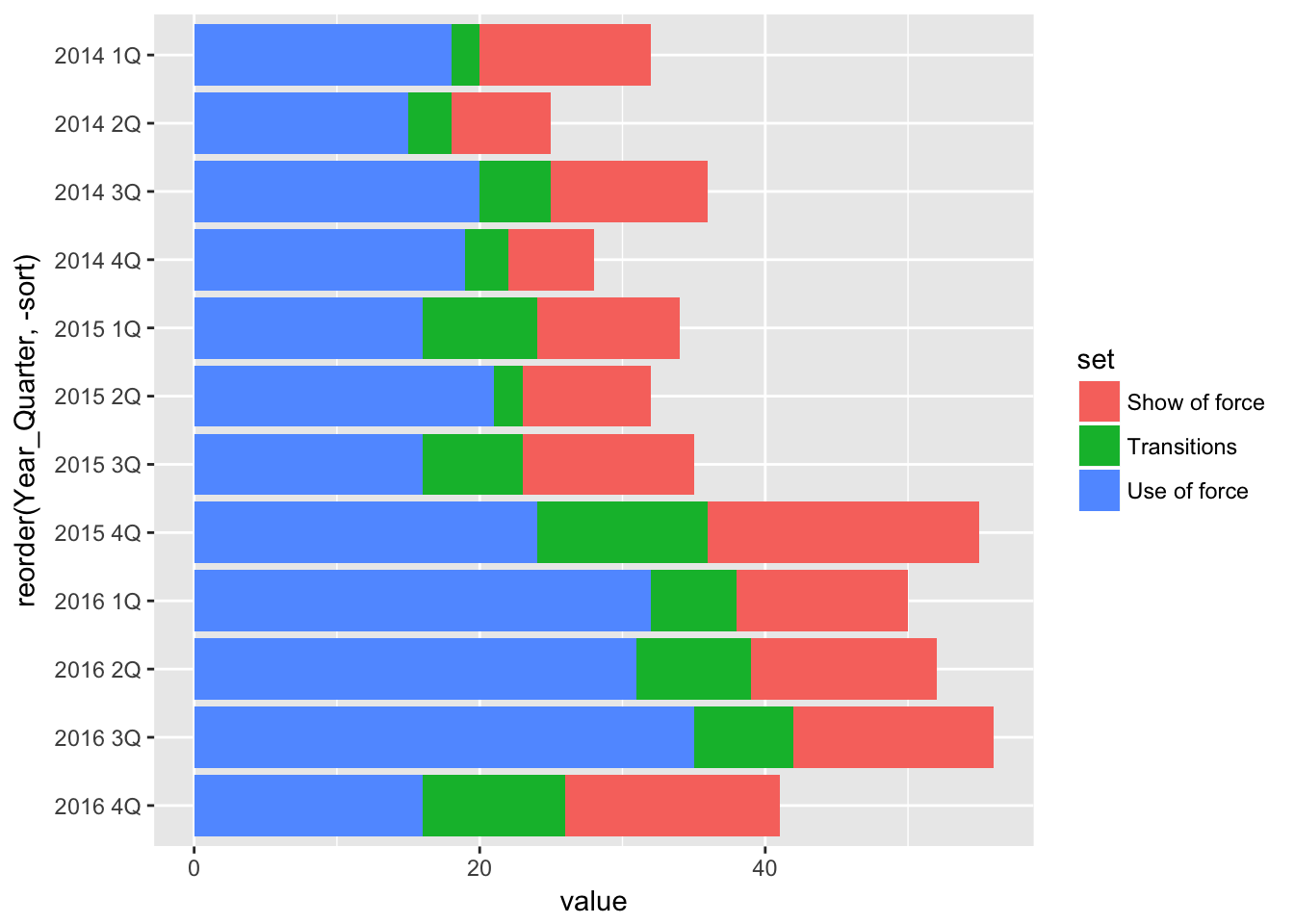
By stacked we mean bars stacked on each other that add up to a whole. And the data we’ll be looking at - three categories of Response to Resistance incidents - is perfect for a stacked bar chart.
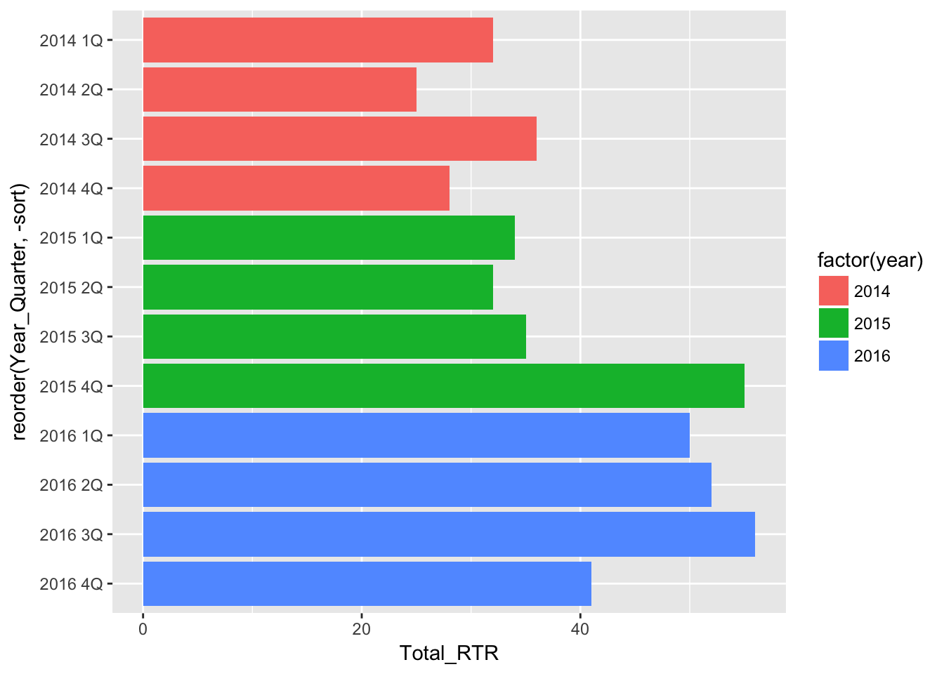
First though, let’s look at how we created a bar chart of total RTR incidents.
# load the libraries
library(readr)
library(ggplot2)
library(ggthemes)

# load the bar chart data
df <- read_csv("dfRTR.csv")
## Parsed with column specification:
## cols(
## year = col_integer(),
## Year_Quarter = col_character(),
## Total_RTR = col_integer(),
## sort = col_integer()
## )# create the chart
basebar <- ggplot(df) +
aes(x = reorder(Year_Quarter, -sort),
y = Total_RTR,
fill = factor(year) ) +
geom_bar(stat="identity") +
coord_flip()
basebar
Not a lot to it, right?
Now let’s load in the data and create a stacked chart.
df <- read_csv("dfsubset.csv")## Parsed with column specification:
## cols(
## Year_Quarter = col_character(),
## year = col_integer(),
## quarter = col_character(),
## Total_CFS = col_integer(),
## Total_arrests = col_integer(),
## Total_RTR = col_integer(),
## sort = col_integer(),
## set = col_character(),
## value = col_integer()
## )stacked <- ggplot(df) +
aes(x = reorder(Year_Quarter, -sort),
y = value,
fill = set) +
geom_bar(stat = "identity") +
coord_flip()
stacked
The only difference between the two commands is the nature of the data we loaded in and what we use for the y value and the fill value.
For y, we use our “value” column which has all the numbers from the three categories of RTR incidents.
For fill, we tell the plot to differentiate the numbers based on the value in the “set” column, which has the names of the three categories. GGplot knows to
Group the bars by the X axis - Year_Quarter. We end up with three values for each year/quarter.
In each group, stack the three bars representing the three values. This is the default behavior for this command. If there was two values, we would have two stacked bars for each year/quarter. If there was only one, we’d have a single bar.
Fill the bars based on the value in “set.” In this case, “Use of force” is colored blue.
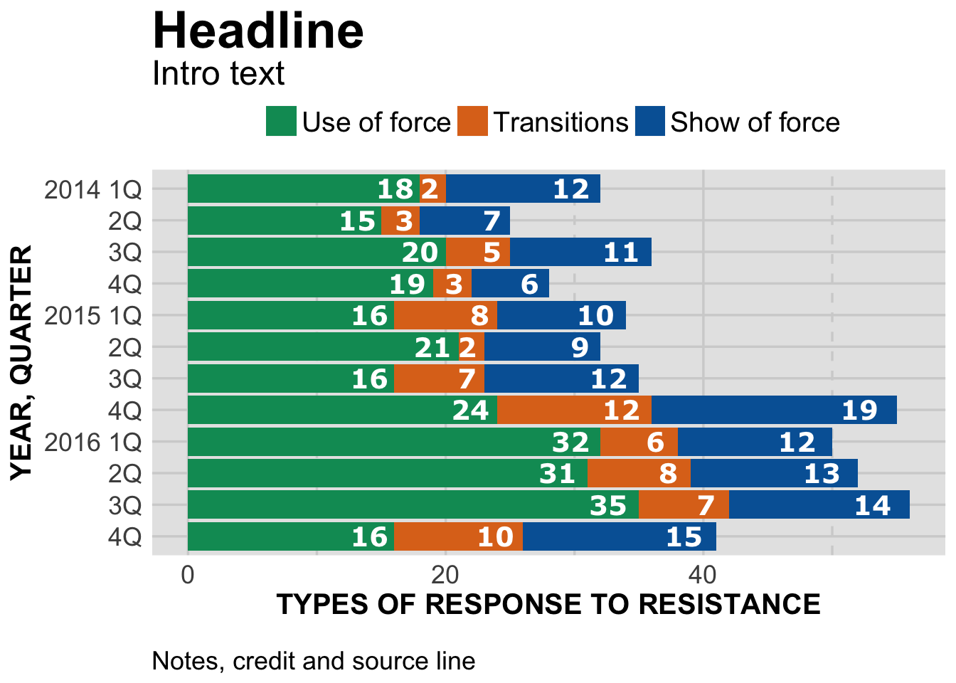
Everything else is just design, pretty much the same as what we used for the basebar plot.
#---------------------
# For windows devices only
# windowsFonts(Verdana=windowsFont('Verdana'))

# This function set styles for the chart
# Be sure to run it before you plot

theme_gfx <- function(...) {
  theme_set(theme_get() + theme(text = element_text(family = 'Verdana', size= 12, lineheight=0.9))) +
    theme(
      # edit background colors
      plot.background = element_blank(),
      legend.background = element_blank(),
      panel.background=element_rect(fill="#E5E5E5"),
      strip.background=element_rect(fill="#E5E5E5"),
      # modify grid and tick lines
      panel.grid.major = element_line(size = .6, color="#D2D2D2"),
      panel.grid.minor = element_line(size = .6, color="#D2D2D2", linetype = "dashed"),
      axis.ticks = element_blank(),
      # edit font sizes
      plot.title = element_text(size = 27,face="bold"),
      plot.subtitle = element_text(size = 18),
      #legend.title=element_text(size = 13,face="bold"),
      legend.text=element_text(size=14.7),
      axis.title=element_text(size=15, face="bold"),
      axis.text=element_text(size=13.5),
      plot.caption=element_text(size=13.5, hjust=0),
      strip.text = element_text(face="bold", size=13.5, hjust=0),
      # This puts the legend across the top
      legend.position="top",
      legend.direction="horizontal",
      # removes label for legend
      legend.title = element_blank(),
      ...
    )
}

#-----Insert plot here -------------

# stacked bars
stacked <- ggplot(df) +
  aes(x = reorder(Year_Quarter, -sort),
      y = value,
      fill = set,
      label = value) +
  geom_bar(stat = "identity") +
  coord_flip() + theme_gfx()

# add all the titles.
stacked <- stacked + labs(
  title="Headline", # your headline
  subtitle="Intro text",
  x="YEAR, QUARTER",
  y="TYPES OF RESPONSE TO RESISTANCE",
  caption="\nNotes, credit and source line") +
  guides(fill=guide_legend(reverse=T))

# Here's where we go further in formating the bar values
# you'll need to edit x, y and label with appropriate values
stacked <- stacked + geom_text(
  position = "stack",
  aes(x = Year_Quarter,
      y = value - (value * 0.025),
      hjust = 1,
      label = value),
  size=5,
  family="Verdana",
  fontface="bold",
  color="white"
  )

# Finally, let's make the axis labels better
# Reverse order since we resorted the bars
stacked <- stacked + scale_x_discrete(
  labels=c("4Q","3Q","2Q","2016 1Q","4Q","3Q","2Q","2015 1Q","4Q","3Q","2Q","2014 1Q")
)

# color scheme - comment out for B/W PDF
stacked <- stacked + scale_colour_manual( values = c("#0063A5", "#DE731D", "#009964", "#DA2128", "#6F2C91") ) + scale_fill_manual( values = c("#0063A5", "#DE731D", "#009964", "#DA2128", "#6F2C91") )
# make B/W PDF - remember to change name of file!
#stacked <- stacked + scale_colour_grey(start = 0, end = 0.75) + scale_fill_grey(start = 0, end = 0.75)

stacked
We needed to make a minor edit in the stacked <- stacked + geom_text( command for the y axis and label (both equal the column “value” instead of “Total_RTR” in the basebar plot.)
But that’s it!
The only things left to do is settle on things like headlines and intro text, and then add in the code to create the three files needed for publications.
Next: grouped bar charts.